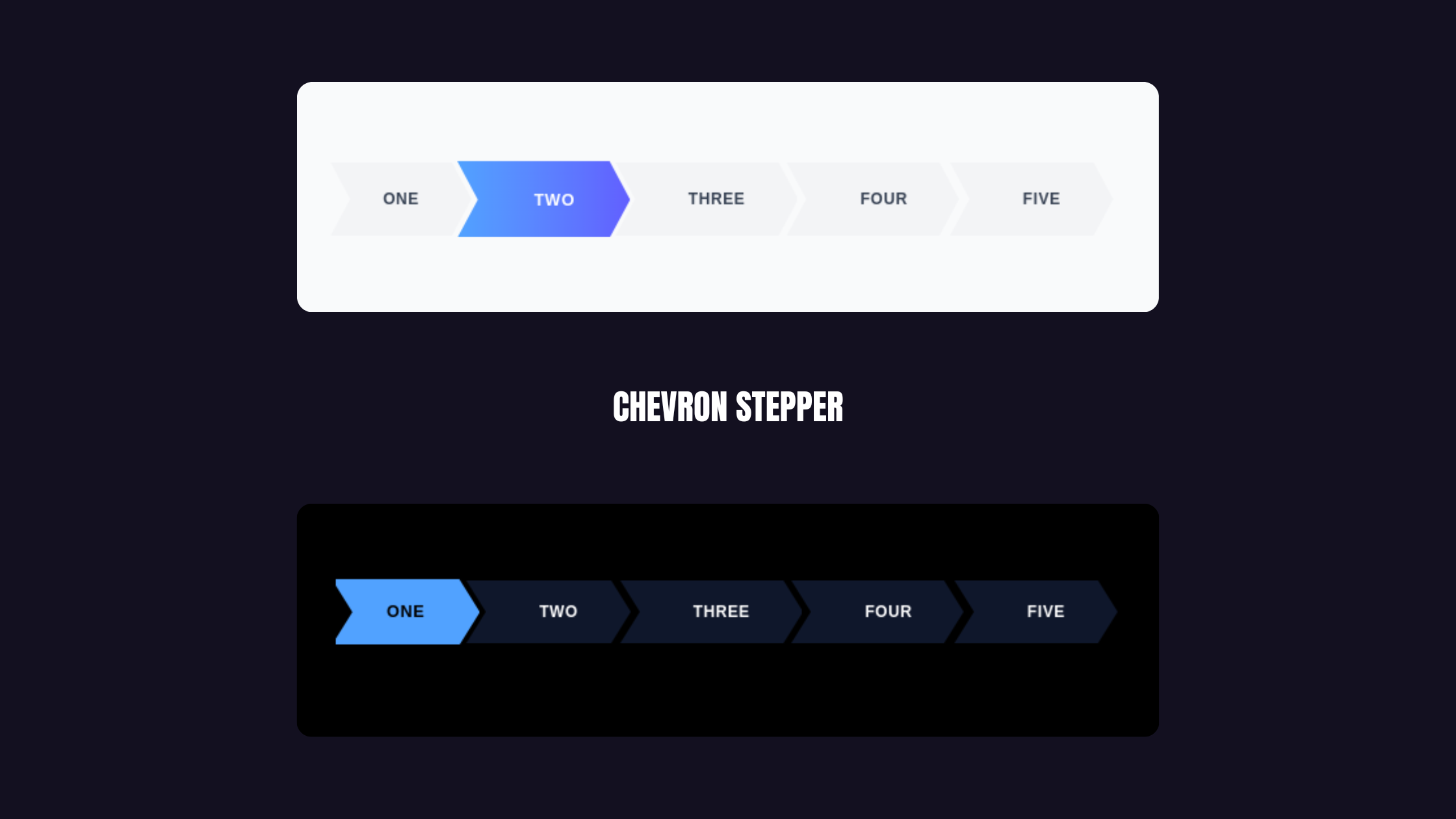
Today, we're building a "Magnetic Arrow Stepper" that handles smooth auto-scrolling, custom shapes, and state management while staying completely reusable.
Key Features
To make this feel "premium," we need three things:
- The "Chevron" Clip-Path: That sharp, overlapping arrow look
- Magnetic Auto-Scrolling: Active step auto-centers (especially crucial on mobile)
- State-Agnostic Design: Works with Redux, Zustand, or local state
The Scrolling Logic
The secret sauce is this useEffect that calculates perfect scroll positioning:
const scrollPos = itemOffsetLeft - containerWidth / 2 + itemWidth / 2;
container.scrollTo({ left: scrollPos, behavior: "smooth" });
Component
import React, { useEffect, useRef } from 'react';

interface StepperProps {
  steps: string[];
  currentStep: number;
  onStepClick?: (index: number) => void;
  canNavigateToStep?: (index: number) => boolean;
  activeColor?: string;
  activeTextColor?: string;
  inactiveColor?: string;
  inactiveTextColor?: string;
  disabledColor?: string;
  disabledTextColor?: string;
  className?: string;
  height?: string;
}

export function ChevronStepper({
  steps,
  currentStep,
  onStepClick,
  canNavigateToStep = () => true,
  activeColor = "bg-yellow-400",
  activeTextColor = "text-black",
  inactiveColor = "bg-slate-900",
  inactiveTextColor = "text-white",
  disabledColor = "bg-gray-100",
  disabledTextColor = "text-gray-400",
  className = "",
  height = "h-12"
}: StepperProps) {
  const containerRef = useRef<HTMLDivElement>(null);
  const activeStepRef = useRef<HTMLButtonElement>(null);

  useEffect(() => {
    const container = containerRef.current;
    const activeItem = activeStepRef.current;

    if (container && activeItem) {
      const scrollPos =
        activeItem.offsetLeft -
        container.offsetWidth / 2 +
        activeItem.offsetWidth / 2;

      container.scrollTo({
        left: scrollPos,
        behavior: "smooth",
      });
    }
  }, [currentStep]);

  const cn = (...classes: string[]) => classes.filter(Boolean).join(' ');

  return (
    <div className={`w-full overflow-hidden bg-transparent ${className}`}>
      <div
        ref={containerRef}
        className="flex items-center w-full overflow-x-auto snap-x snap-mandatory no-scrollbar py-2"
        style={{ scrollbarWidth: 'none', msOverflowStyle: 'none' }}
      >
        {steps.map((step, index) => {
          const isActive = currentStep === index;
          const isDisabled = !canNavigateToStep(index);

          return (
            <button
              key={step}
              ref={isActive ? activeStepRef : null}
              onClick={() => !isDisabled && onStepClick?.(index)}
              disabled={isDisabled}
              className={cn(
                "relative flex justify-center items-center px-10 outline-none shrink-0 transition-all duration-300 snap-center",
                "cursor-pointer disabled:cursor-not-allowed",
                height,
                "[clip-path:polygon(calc(100%-15px)_0%,100%_50%,calc(100%-15px)_100%,0%_100%,15px_50%,0%_0%)]",
                index !== 0 ? "-ml-2" : "",
                isActive
                  ? `${activeColor} ${activeTextColor} z-20 shadow-xl scale-105`
                  : isDisabled
                  ? `${disabledColor} ${disabledTextColor} z-0`
                  : `${inactiveColor} ${inactiveTextColor} hover:opacity-90 z-10`
              )}
            >
              <span className={cn(
                "font-bold text-xs uppercase tracking-wider whitespace-nowrap",
                index !== 0 ? "pl-4" : ""
              )}>
                {step}
              </span>
            </button>
          );
        })}
      </div>
    </div>
  );
}
Usage
const steps = ["One", "Two", "Three", "Four", "Five"];

<ChevronStepper
  steps={steps}
  currentStep={activeIdx}
  onStepClick={(val) => setActiveIdx(val)}
/>
See it in action